Time Logging App
UX Redesign
Background
Each day, both hourly and salary employees where I used to work clocked in and out on an app.
Design Opportunity
The user experience and navigation of the app is frustrating. It seems that the app wasn’t actually designed for one of the primary uses for most employees - clocking in and out.
Strategy
To understand the issues and identify friction points by deconstructing the user flows of logging time.
Goal
To make the experience of logging time and accessing pay-related information quick and painless for employees.
Company
Personal Project
Team Members
Just Me!
Contributions
Gap Analysis
Site Mapping/Information Architecture
User Experience Design
User Interface Design
Identifying Issues - Self Exploration
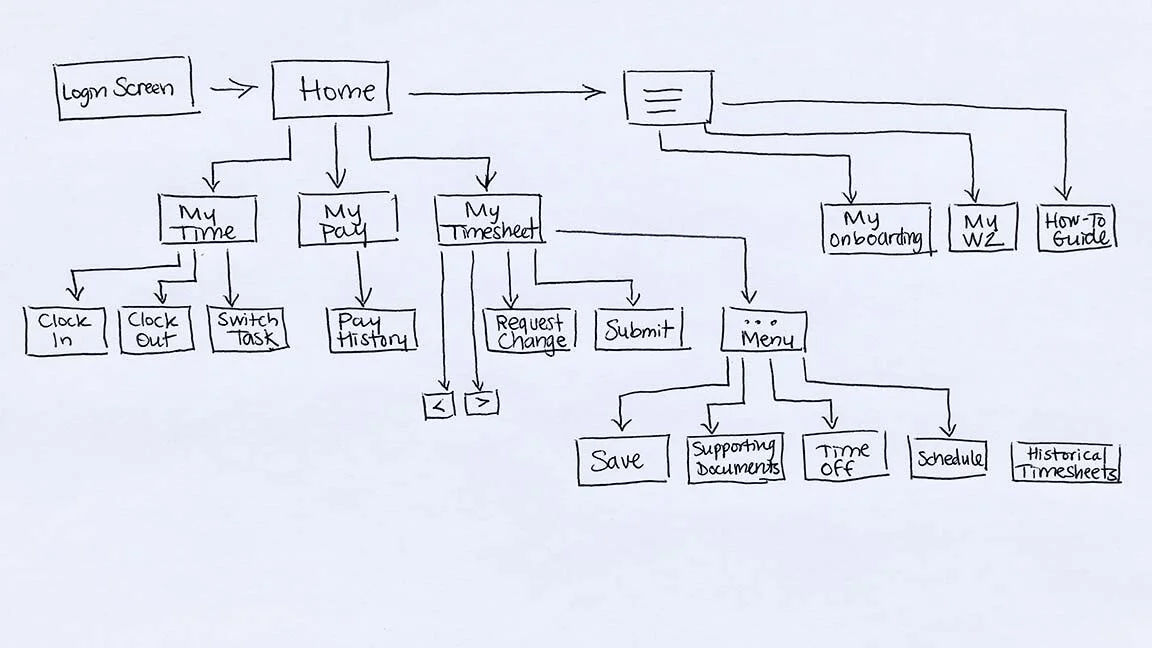
My first step was to break down the information architecture of the app into a more easily digestible site map. I walked through the app to lay it all out on paper. Then I highlighted parts I accessed daily in yellow, and more than once a month in green.
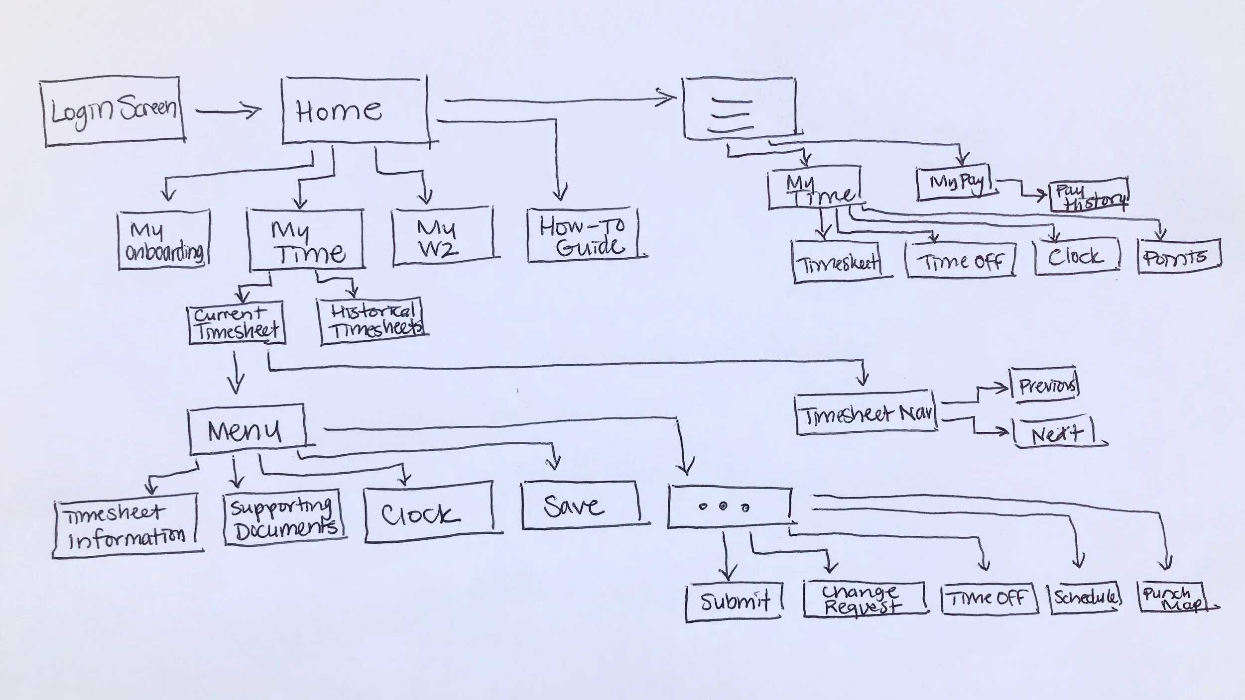
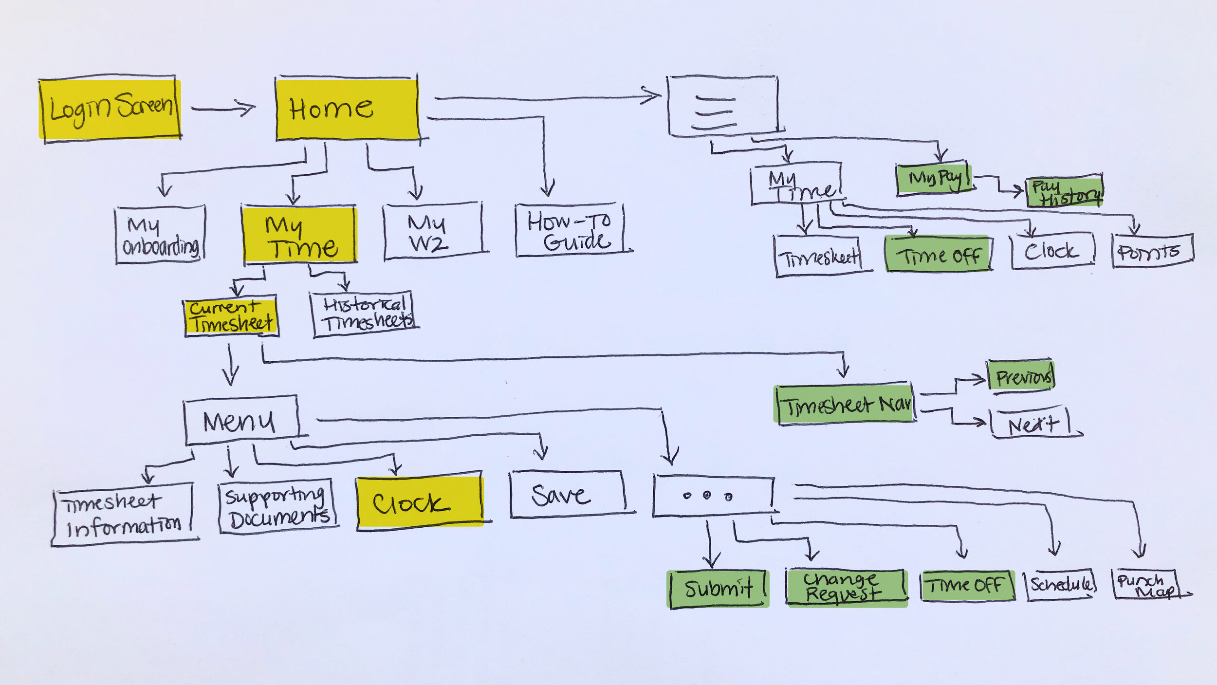
I could immediately identify a prominent issue - all the features I needed to access regularly were buried multiple menus deep, while the home page menu consisted mostly of features I never used.
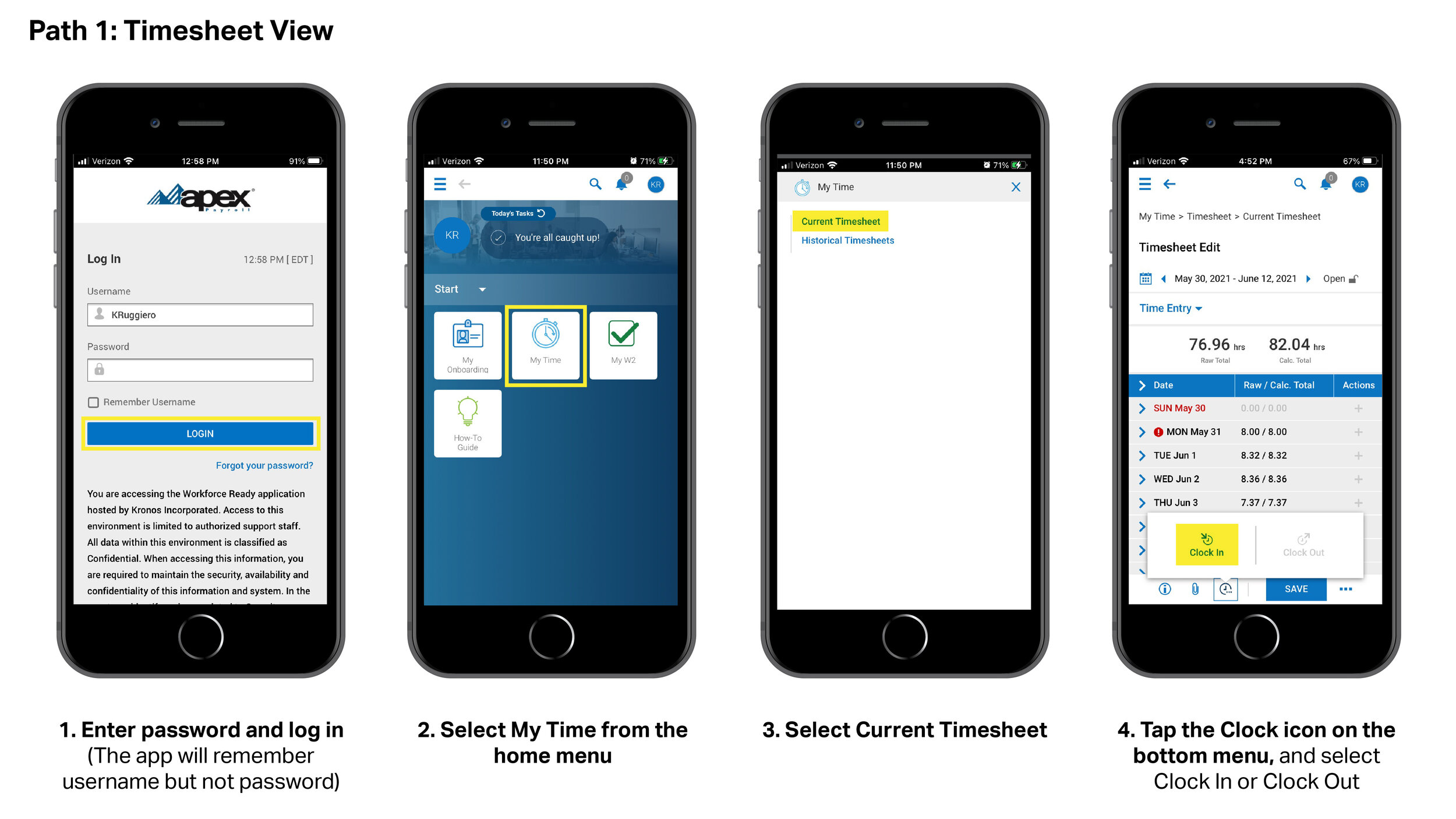
There are also multiple methods for clocking in and out, with 2 different paths to access them. Both require several steps and I am unsure which was intended as the Happy Path for the user.
Below, I show the 2 processes of clocking in or out, which most employees do 4 times per day.
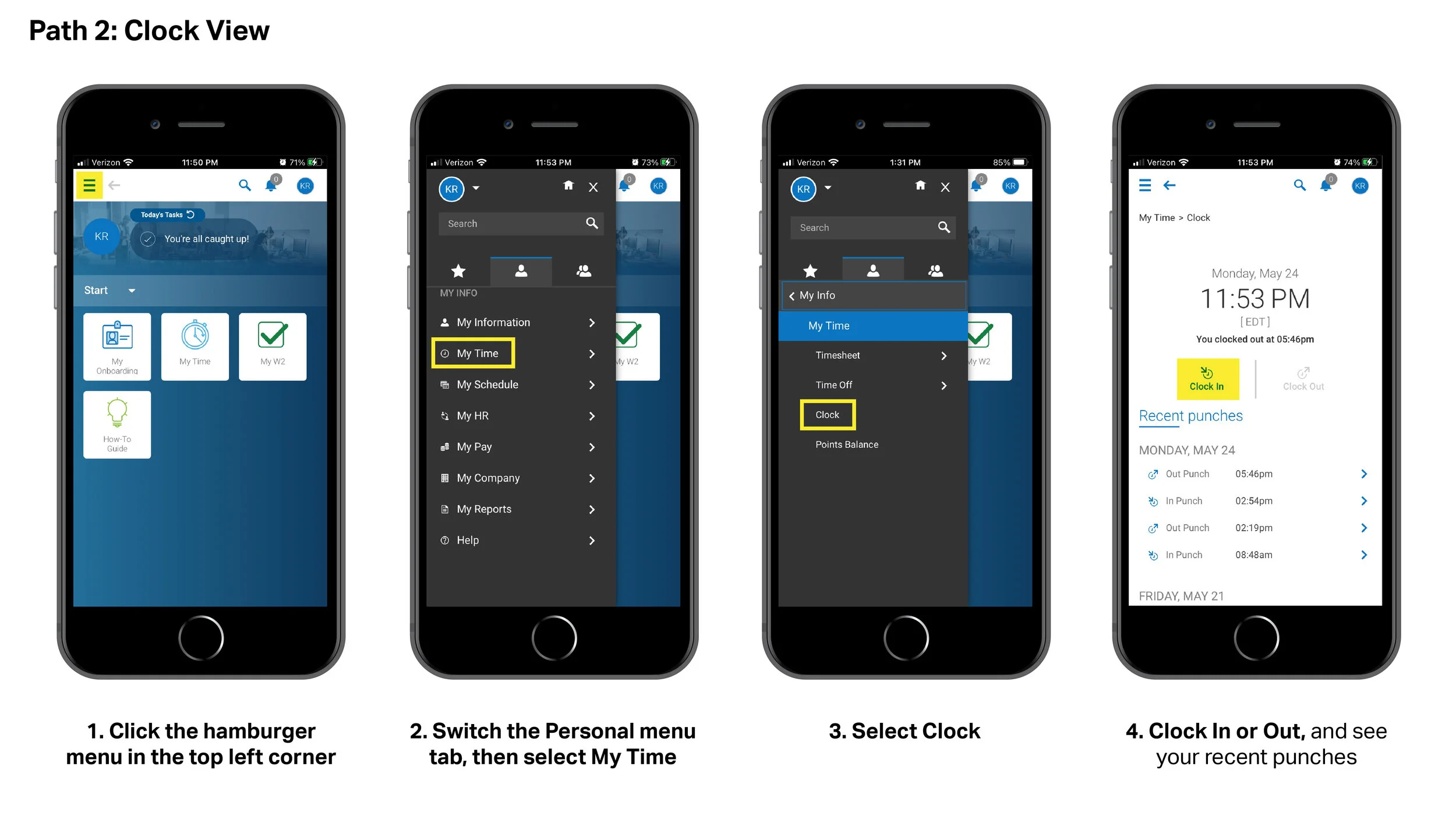
I prefer the Clock page on Path 2, as I think it has presents information in a more digestible way. However, it is even more steps than Path 1 after logging in. It is unclear to me why this Clock page is available under this My Time menu, but not the one on the home page.
Identifying Issues - Asking Coworkers
When I spoke to other employees about their experience with the app, they had the same frustrations with the time consuming login process.
“Clocking in and out takes far too much time. Upon logging in, there is not a simple button on the Home Screen or in the menu to log in. I am required to click “My Time” then select “Current Timesheet”. The clock in/clock out buttons are difficult to find on this busy page.” - Coworker #1
“Just clocking in is a fiasco. You log in, and you click “My Time”, and then there’s two very small buttons you gotta choose between, you can easily hit the wrong one. You have to go way to the bottom for this very tiny, hard to find button that you press that brings up a sub-button to clock in.” - Coworker #2
However, I also uncovered an additional hiccup that I had not yet considered. I change between multiple tasks throughout the day, but all fall under the umbrella of “Production/Operations.” Other employees have some tasks that fall into “Production/Operations” and other tasks that are considered “Marketing”, and they are expected to differentiate their logged time between the two.
Therefore, some employees have to clock in and out additional times during the day just because they are switching over to tasks for another department.
These users have to go into their timesheet and select the department from the dropdown menu from each time range, as seen in the highlighted area of this image. The times are not editable, so they have to remember to make this switch in real time.
“Sometimes I won’t even track what I’m working on because it’s such a pain to log in and out every time I change tasks. It doesn’t seem worth the effort.” - Coworker #3
“I didn’t even know this menu existed. I work in both departments so I’m probably supposed to be using it, huh?” - Coworker #4
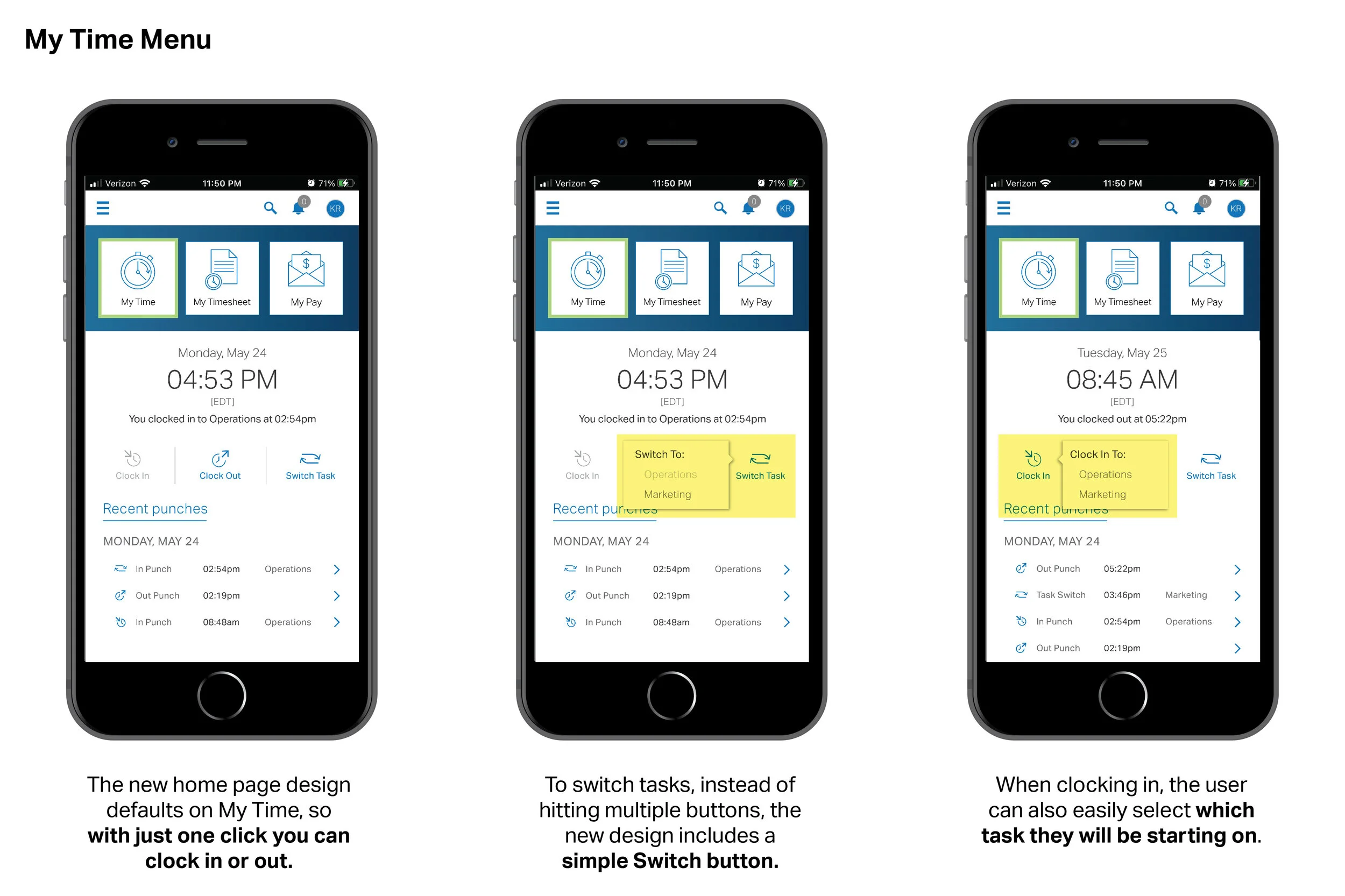
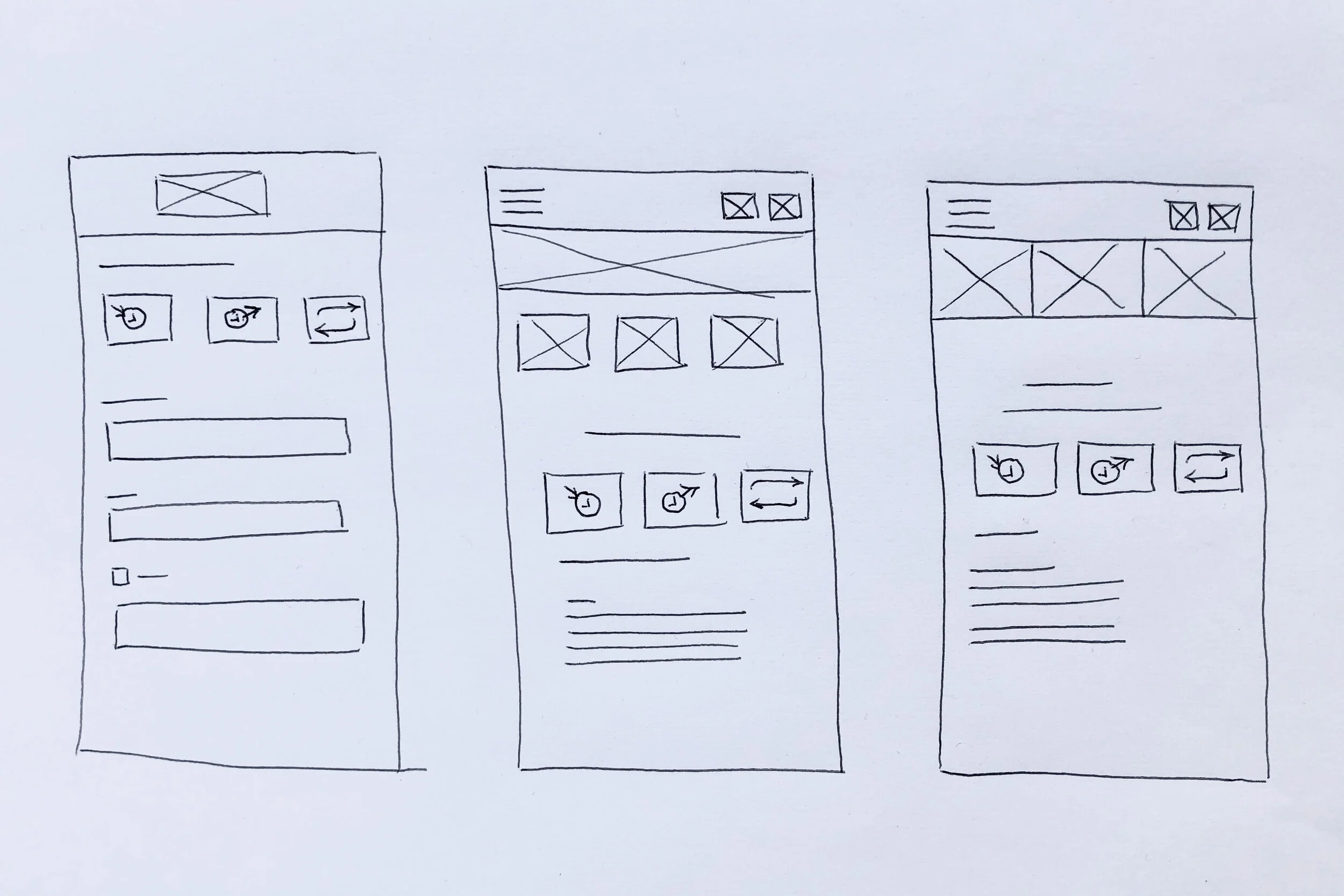
For these reasons, I felt it was best to add a button to the clock to allow the user to switch tasks more easily. Using low-fidelity wireframe sketches, I began to brainstorm page arrangements where these 3 “clock” buttons could be located.
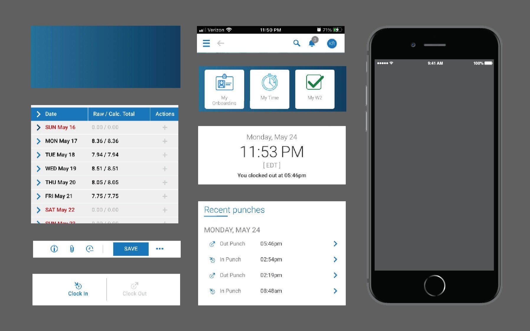
The icon buttons on the current home page are a helpful navigation tool, so I decided to keep that concept and update them to guide the user to more heavily-used features of the app. I took many screenshots of the existing app, and cropped sections to mock up screens with.
Updated User Flow
Now, all daily use tasks are just a step away from the home screen, and monthly tasks are well within reach too.
Once again, I have highlighted features I access daily in yellow, and more than once a month in green.
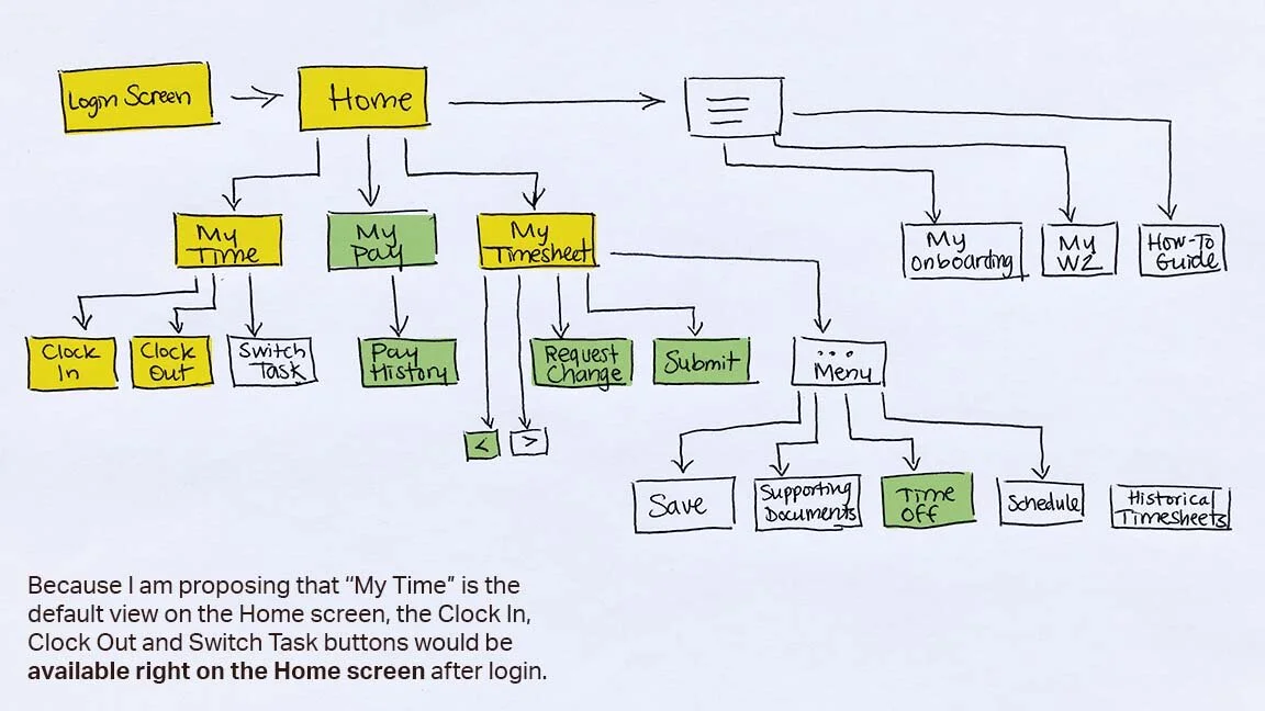
My Proposed Redesign
• Users can clock in and out from the home screen.
• Users who perform tasks in multiple departments can switch between tasks with ease.
• Menu buttons at the top can be customized - jump easily between them with less menu navigation.
This app already has some successful features and areas of good UI. I felt that by utilizing those, in combination with reducing the number of steps in the Happy Path, the overall user experience could be smoother and more positive.
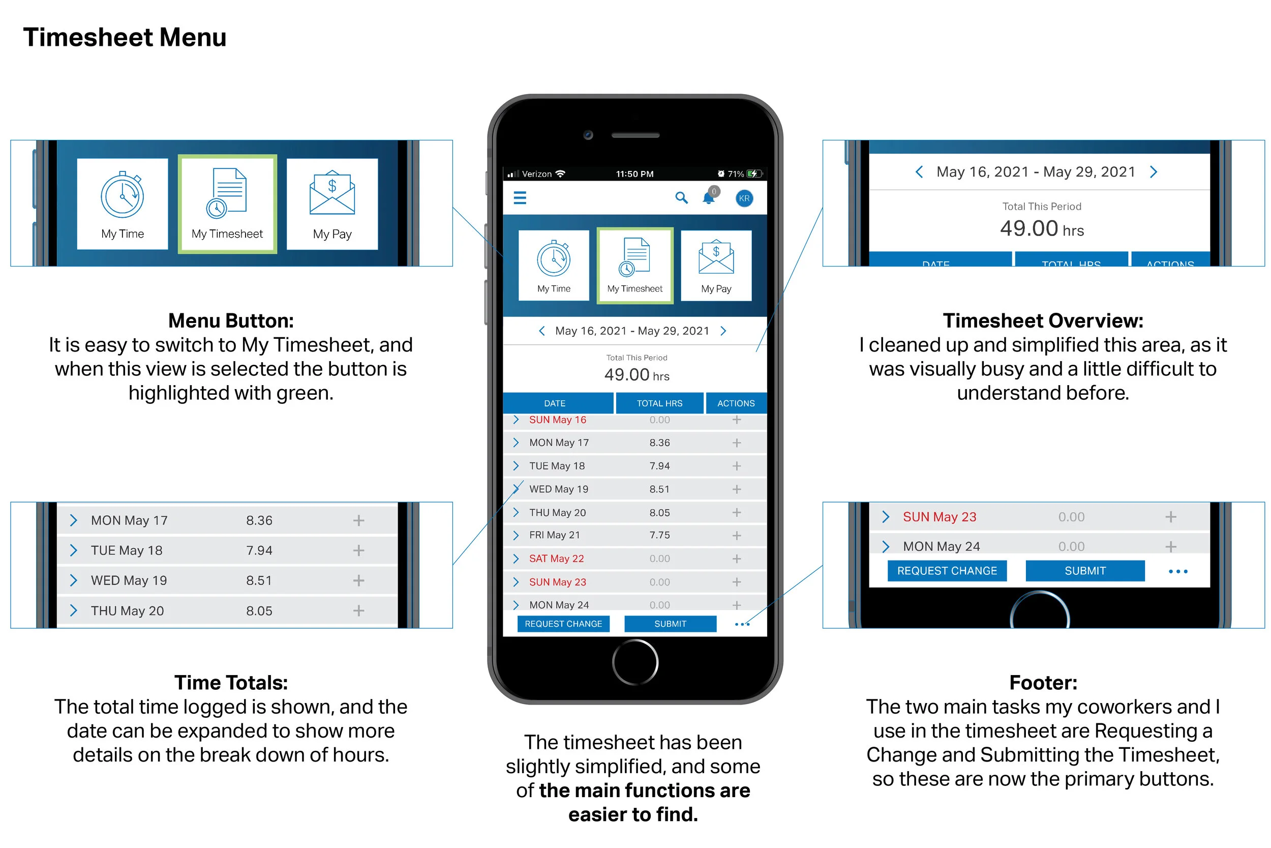
I created new icons for My Timesheet, My Pay and Switch Task. I kept the basic original color scheme, additionally utilizing lime green as a highlight color to reinforce which menu item the user is currently under.